
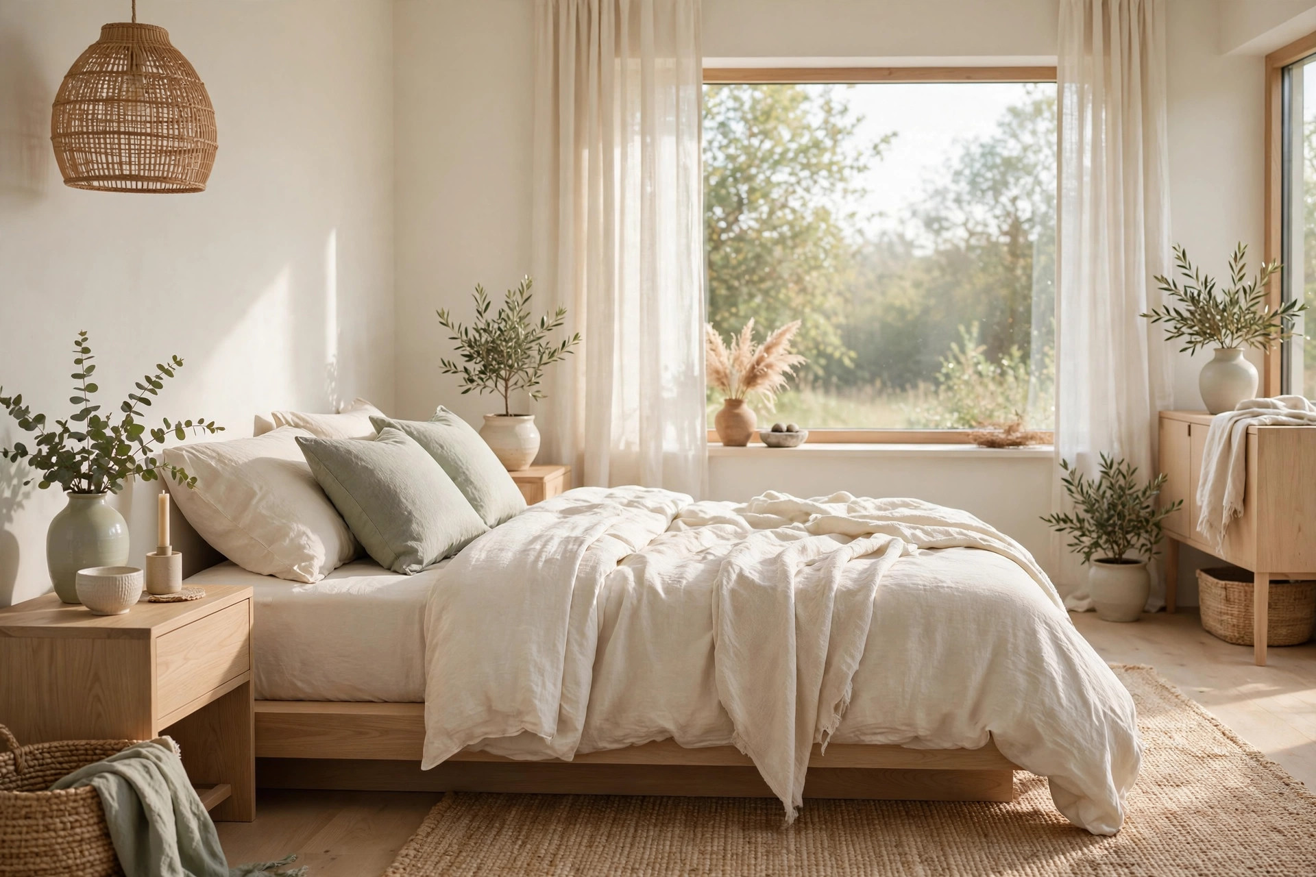
Choosing a paint color for the bedroom sounds simple until you’re standing in the store holding forty swatches that all look like “kind of beige.” If that sounds familiar, you’re not alone. The bedroom is the room where color matters most, because it’s the first thing you see in the morning and the last thing you see at night.
Here’s the good news. Modern bedroom color ideas don’t have to mean cold gray walls or a stark white box. The most restful modern rooms usually sit somewhere warmer, from creamy whites and soft taupes all the way to deep forest greens and inky blues that feel like a hug at bedtime.
Below are 24 modern bedroom color ideas grouped by mood, so you can start pale and gentle or go straight for the dramatic end. Each one includes the finishes and fabrics that typically make it work, plus a few simple ways to test a shade before a single wall gets painted.
Warm Whites and Creams
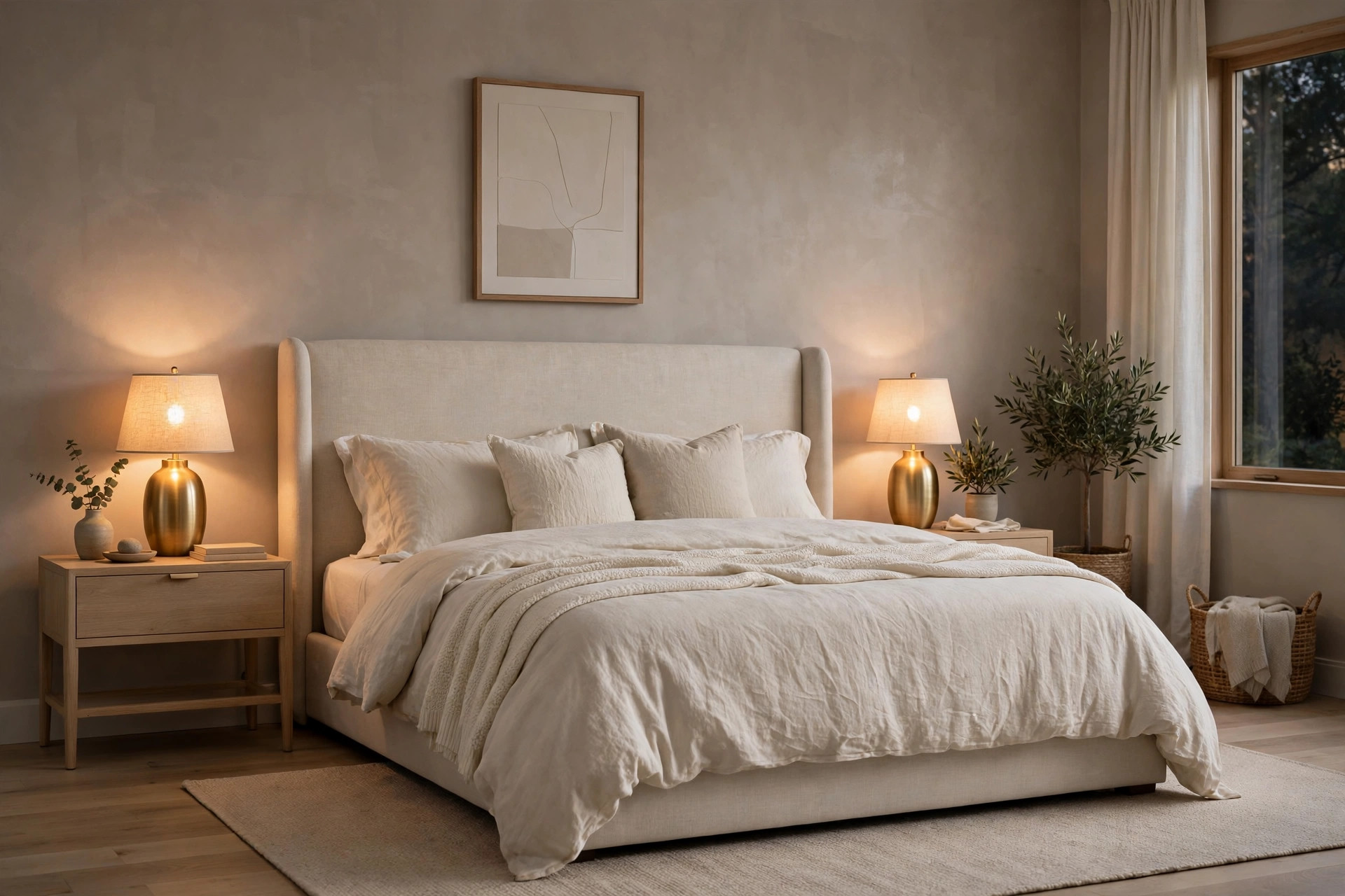
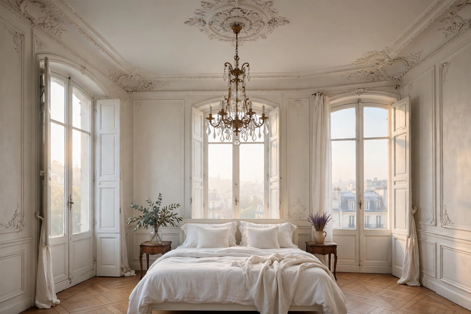
Warm whites are the quiet backbone of the modern bedroom. They bounce light around, make small rooms feel bigger, and they never fight with your bedding when you fancy a change. The trick is picking a white with a warm undertone, so the room feels soft rather than clinical.
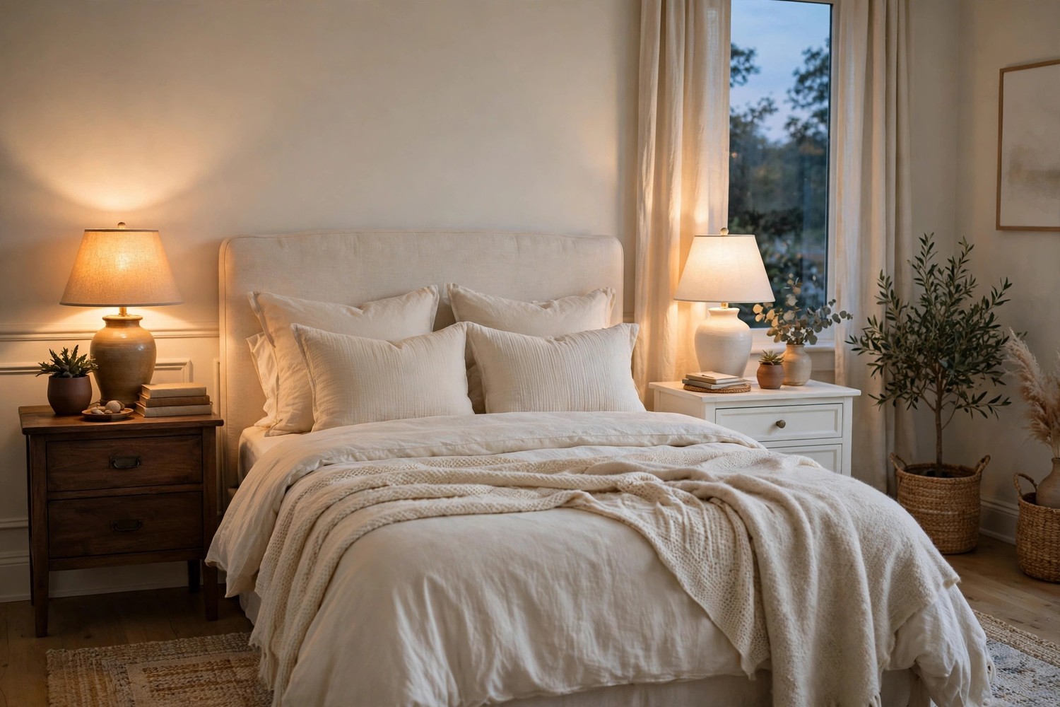
Start with a warm white on all four walls. A white with a hint of cream or ivory usually flatters skin tones and wood furniture far better than a blue toned bright white. It keeps the room feeling calm in daylight and cozy once the lamps come on. If your room gets a lot of sun, this is often the safest place to begin.
Layer cream on cream for a soft tonal look. Creamy walls, ivory bedding and an oatmeal throw create depth without any strong color at all. The layers do the work, so the room reads interesting instead of blank. Add one textured cushion and the whole bed suddenly looks styled.
Pair ivory walls with light oak furniture. Pale wood against a warm ivory backdrop is a combination that rarely dates. The wood brings the warmth, the walls bring the light, and together they suit almost any bedding color you rotate in later. It’s a particularly good base if you like changing your look with the seasons.
Go a half shade deeper on the trim. Painting skirting boards and door frames in a slightly deeper cream than the walls adds quiet definition. It sounds like a tiny detail, but it usually makes the whole room feel more finished and deliberate. Keep the ceiling the same color as the walls if you want the space to feel taller and softer.
Add soft sage as the one gentle accent. Warm white rooms love a whisper of green, and sage is typically the calmest way to do it. Try it in cushions, a folded throw or a single upholstered chair rather than on the walls. Living plants echo the color for free and make the white feel fresher.
Choose warmer whites for a north facing room. North light tends to make colors look cooler and a little gray, so a creamy white usually compensates nicely. It stops the room from feeling chilly in the morning when the light is at its flattest. Test your shortlist on the darkest wall first, since that’s where a white can turn dull.
Warm up white bedding with a clay toned throw. If you love crisp white bedding but worry it feels stark, a throw in soft clay or muted terracotta fixes it in seconds. The warmth sits right where your eye lands, and you can fold it away in summer. A pair of natural linen pillowcases in a flax tone does a similar job.
Taupes and Greiges
If white feels too plain and gray feels too cold, taupe and greige were basically invented for you. These muddy middle tones are warm, forgiving and surprisingly easy to live with, which is why designers keep coming back to them for modern bedrooms.
Use greige when you can’t decide between gray and beige. Greige shifts with the light, looking grayer in the morning and warmer by lamplight, so it rarely feels wrong. It’s a practical pick for a room that gets mixed light through the day. Pair it with white bedding and the walls do all the mood work on their own.
Try mushroom taupe on all four walls. A mid tone taupe wraps a bedroom in a calm, cocooning way without going dark. It typically suits rooms with decent natural light, where it reads soft rather than heavy. Cream textiles and brushed brass details keep it feeling elegant instead of flat.
Paint one taupe wall behind the bed. If four walls of color feels like a big step, a single deeper wall behind the headboard gives you the look with less commitment. The bed becomes the focal point, and pale bedding pops against the deeper tone. It’s also the easiest wall to repaint later if your taste changes.
Go two tone with taupe on the lower half. A deeper taupe on the lower part of the wall with warm white above gives you color and light in one scheme. It grounds the room and hides the scuffs that usually collect around furniture level. Run the darker shade onto built in wardrobes for a calm, joined up feel.
Add brushed brass and matte black accents. Taupe and greige can drift a little plain on their own, and warm metal plus a touch of black usually sharpens them right up. Think brass lamp bases, black picture frames or a dark curtain pole. Keep the doses small and the effect stays modern rather than industrial.
Layer stone colored textiles over white bedding. Not ready to paint at all? Stone, putty and mushroom shades in throws, cushions and curtains give you the taupe mood in fabric form. It’s fully reversible, which makes it a good rehearsal before committing to paint. Most people find they love it, and the paint follows a season later.
Deep Greens and Blues
At the deeper end of the palette, green and blue earn their place by being naturally restful. They’re the colors of forests and deep water, and in a bedroom they usually read calm rather than loud, especially when you balance them with cream bedding and warm wood.
Forest green
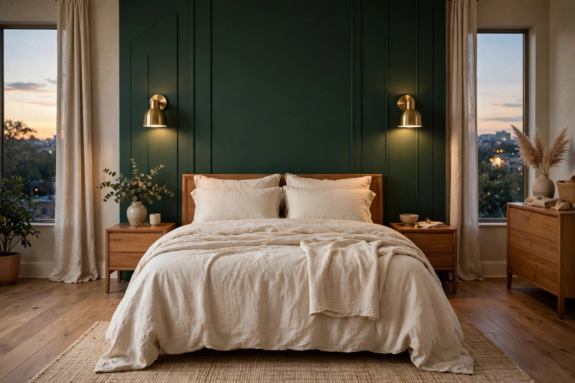
Put forest green behind the bed only. A deep green wall behind the headboard turns the bed into the whole show, and the other walls can stay warm white. Cream and ivory bedding glows against it, and brass sconces look especially good on this color. It’s the dramatic option that still lets you retreat if you change your mind.
Take deep green around all four walls. In a room you only really use for sleeping, a full wrap of forest green can feel incredibly cocooning. Lighter bedding and a pale rug keep it balanced, and warm lamplight does the rest. Smaller rooms often suit this better than big ones, since there’s less wall competing for attention.
Soften green with natural textures. Deep green can feel formal, so rattan, linen and light wood usually loosen it up. A woven pendant shade or a jute rug brings the forest feeling in a relaxed way. Add a leafy plant and the wall color suddenly feels like part of a garden room.
Inky blue
Try inky blue as a softer alternative to black. A very deep blue gives you the same drama as charcoal but with a gentler, sleepier mood. It pairs beautifully with warm white bedding and pale wood floors. In evening light it often reads almost black, then shows its blue again in the morning.
Pair midnight blue with brass lighting. Warm metal against deep blue is a classic for a reason, since the brass seems to glow a little brighter. Choose warm toned bulbs so the blue stays rich rather than cold. A pair of brass reading lights either side of the bed makes the whole wall feel intentional.
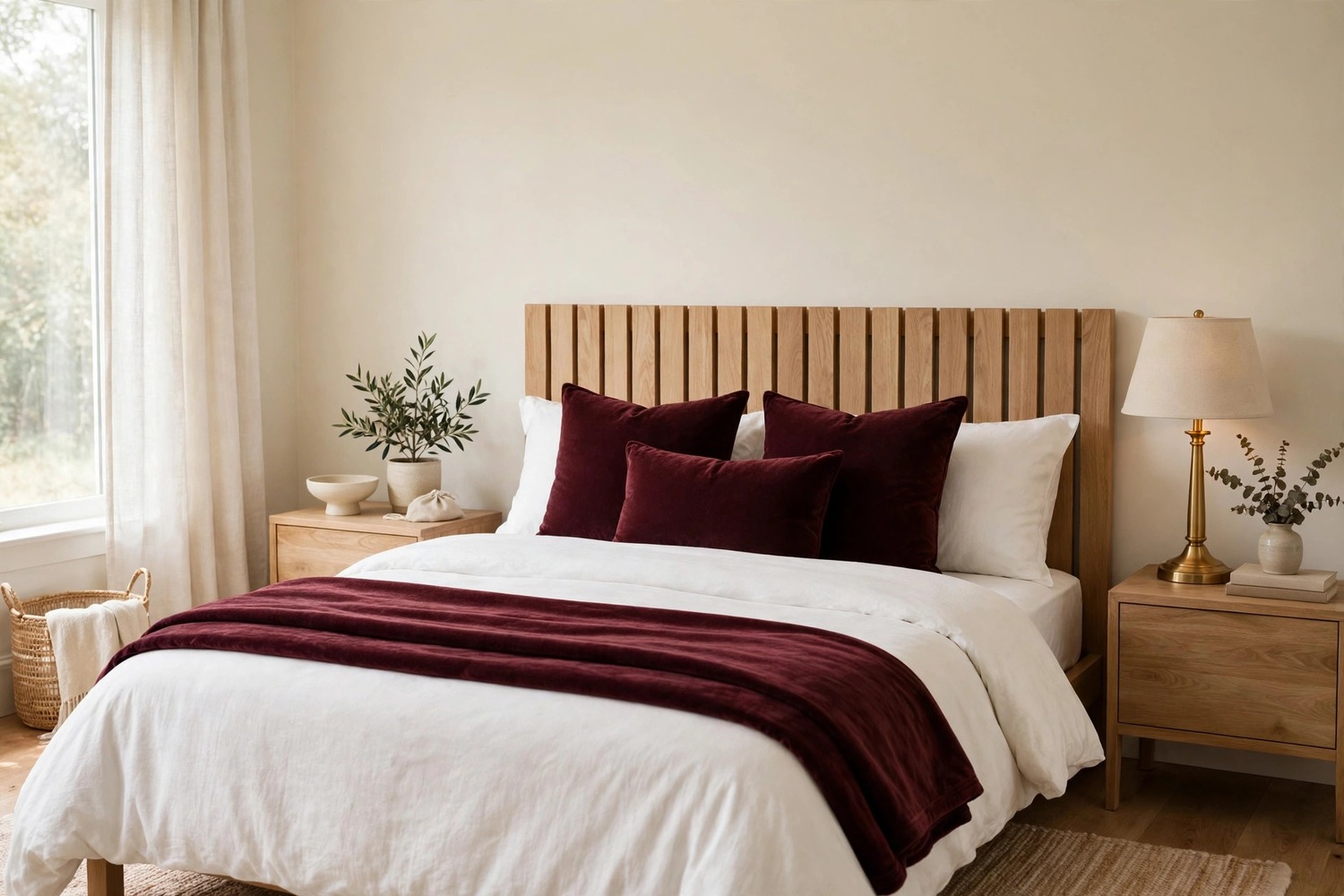
Bring blue in through textiles first. If a blue wall feels like a leap, an inky duvet set, velvet cushions or a deep blue throw gives you most of the mood with none of the commitment. Layer two or three blue tones together so it looks collected rather than matched. You can always promote your favorite shade to the wall later.
How to Test a Color Before You Commit
Even the most beautiful color can misbehave in your light, so a little testing saves a lot of repainting. These are the simple checks that typically separate a color you love on day one from a color you love for years. Think of them as cheap insurance for your decorating decisions.
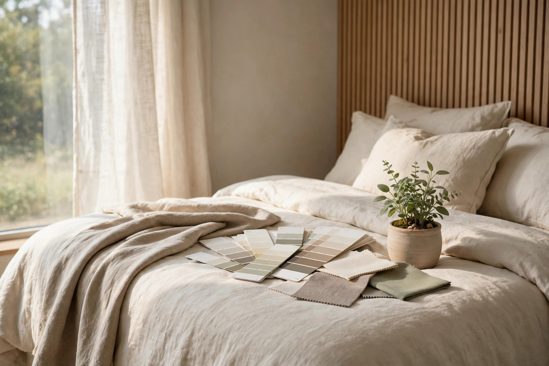
Paint a big swatch, not a tiny one. A small patch lies to you, so paint a square at least as big as a pillow, or paint a large board you can move around. A board is even better because you can prop it against different walls. Let it dry fully, since most colors dry a touch darker than they look when wet.
Live with it for a few days. Check your swatch in bright morning light, dull afternoon light and warm lamplight before you decide. A color that survives all three is usually a keeper. If you only check it once at noon, the evening version can be an unwelcome surprise.
Hold your bedding and flooring up against it. Colors don’t live alone, so drape your duvet and a curtain over the swatch and stand back. Your floor matters too, since warm wood can pull a neutral warmer than you expect. If the combination feels calm to your eye, it probably is.
Start with the wall behind the bed. Still nervous? Paint the least committal wall first, which is usually the headboard wall. You barely see it from the bed, but you get the full effect from the doorway and in photos. If you love it, painting the rest later is an easy weekend job.
Buy the smallest pot first. Sample pots exist for exactly this reason, and they’re far cheaper than repainting a whole room. Label each pot with the wall you tested it on, because greige number four will blur with greige number five by Friday. Your future self will thank you for the notes.
Whether you land on warm white, mushroom taupe or a full forest green embrace, the calm modern bedroom rule is usually the same. Keep the palette limited, let texture do the talking, and test before you commit. Your perfect shade is out there, and it probably looks even better with your own bedding than it does on the swatch card.

Leave a Reply