
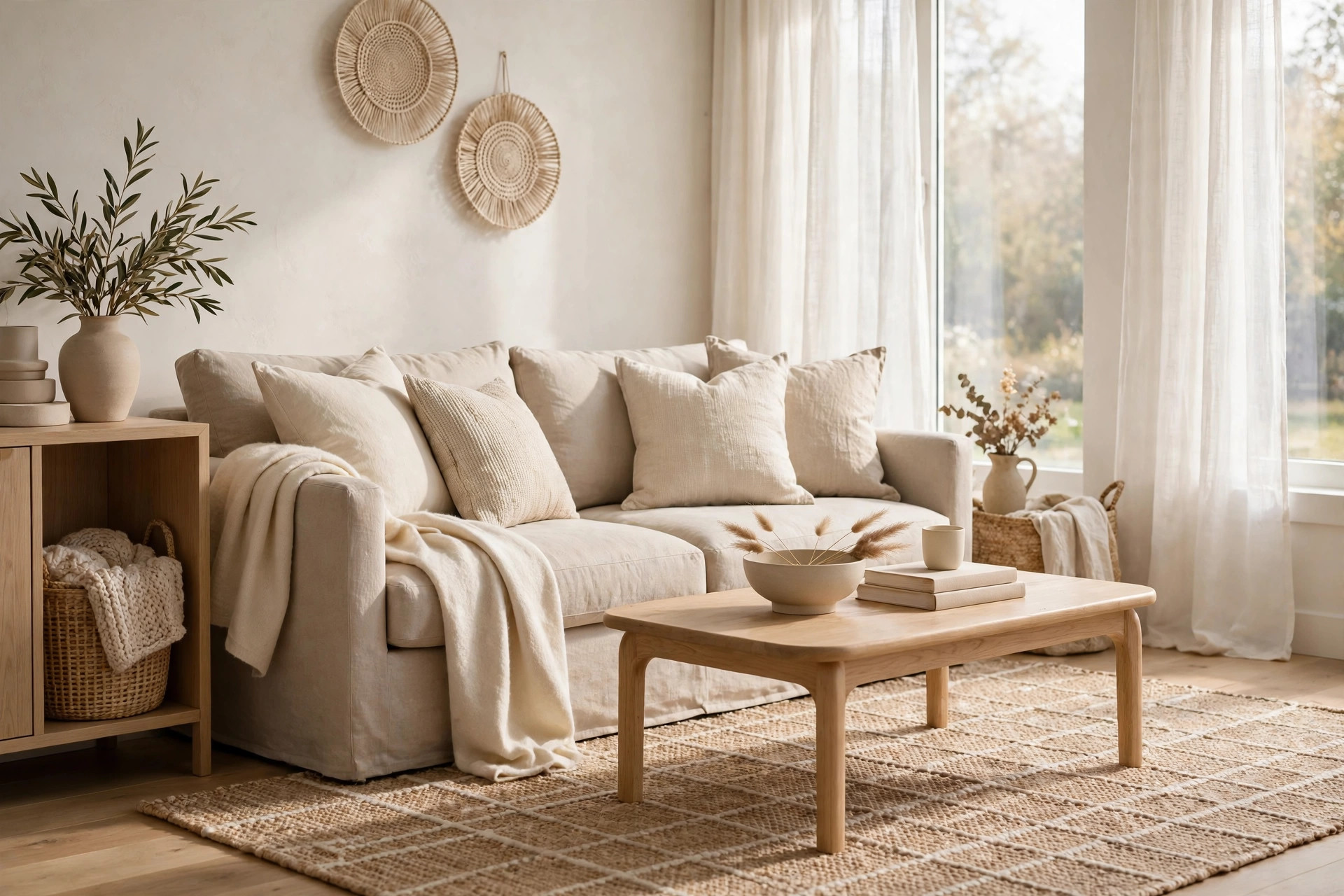
If you have ever stood in a paint shop holding six nearly identical swatches, you are not alone. Living room colors feel like a big decision, because this is the room where you relax, host friends and spend most of your waking hours at home.
The good news is that you do not need a bold personality or a design degree to get it right. Most beautiful living rooms are built on a calm base, with softer colors and one or two deeper accents layered in slowly. Start gentle, then go deeper only where it feels good.
Below are 21 living room color ideas, grouped from the quietest neutrals through soft mid tones to the deeper shades that add drama without the gloom. Pick the section that matches your comfort level and borrow a few ideas at a time.
Calm Neutrals That Layer
Neutrals get called boring, but a layered neutral room is usually the one everyone wants to curl up in. The trick is to treat neutrals like colors in their own right, mixing several tones and textures so nothing looks flat. Think of it as mixing paints on a palette, just with sofas, rugs and cushions instead.
Start with warm white walls. A warm white has a hint of cream or beige underneath, so it feels soft instead of stark. It works with almost any furniture you already own, which makes it a safe first step. If your room faces north, a warmer white usually stops the light from feeling cold and gray.
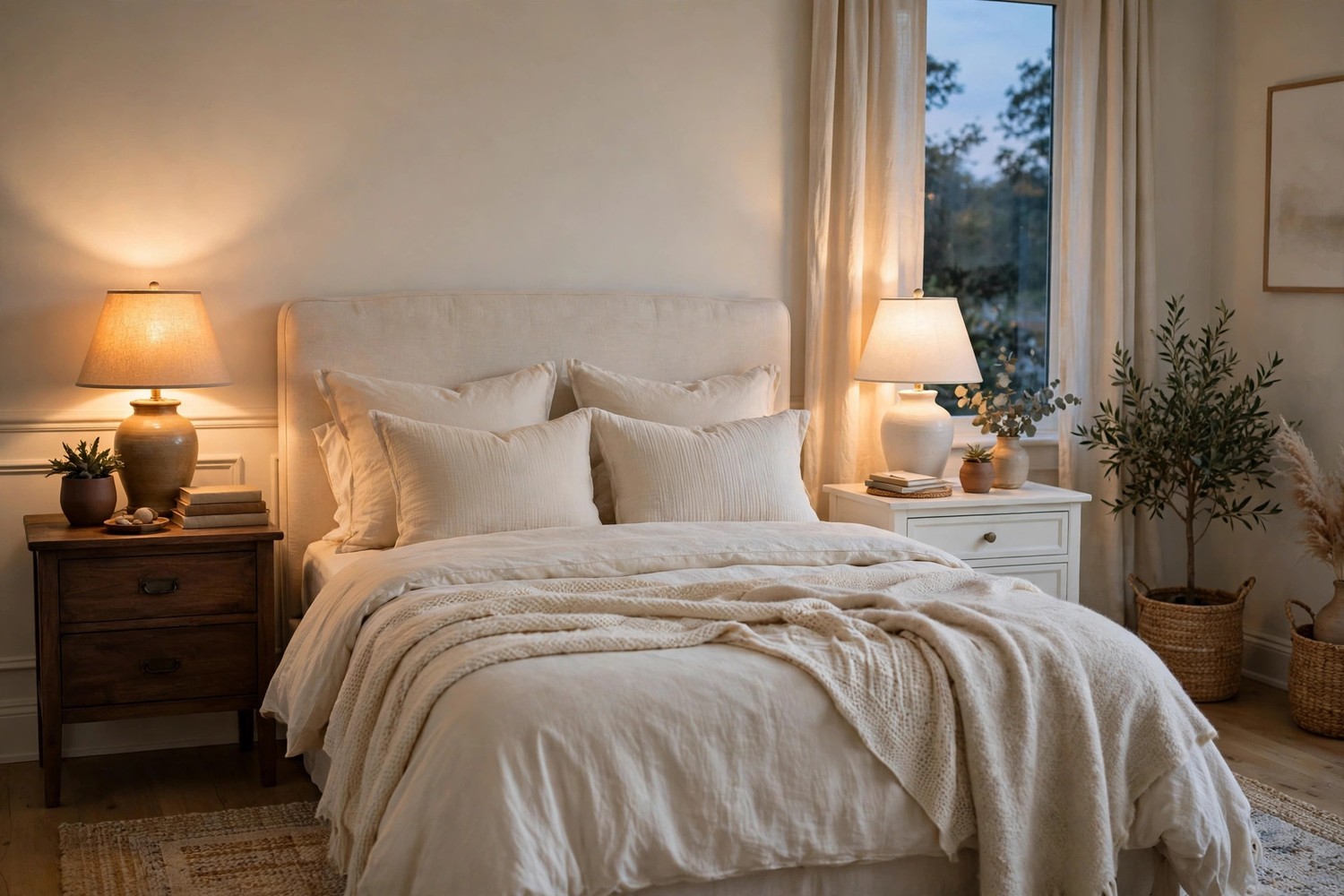
Layer beige on beige. A beige sofa, a slightly deeper beige rug and pale beige curtains create depth without any strong color at all. The secret is contrast in tone rather than contrast in hue. Add light wood and a few cream cushions and the room feels calm but never plain. A woven throw or a subtly patterned cushion in the same family keeps the layers from blending into one blur.
Try greige when you cannot decide. Greige sits between gray and beige, and it changes gently with the light through the day. It is a friendly backdrop for warm metals like brass and for natural textures like linen and rattan. Because it reads neutral from every angle, it is typically easy to live with for years.
Let light wood act as a color. Pale oak floors, a light wood coffee table or rattan chairs bring warmth that paint alone cannot. Wood tones count as part of your color palette, so plan them the way you would plan a wall color. Mixing two or three light woods usually looks collected rather than matched.
Bring in cream and oatmeal textiles. Cushions, throws and curtains in cream and oatmeal soften the edges of a neutral room. These pale, warm tones layer beautifully because none of them fight for attention. Choose chunky knits, linen and wool so the pale palette still feels rich to the touch.
Add a touch of soft stone gray. A little cool gray keeps an all warm scheme from feeling sleepy. Try it in a cushion, a throw or the frame of your artwork rather than on all four walls. Balanced against warm whites and wood, stone gray usually reads calm and modern instead of chilly.
Ground it all with a natural rug. A jute, sisal or undyed wool rug in a natural tone anchors the seating area and adds quiet pattern. It also hides everyday dust better than a pale flat rug would. If a full natural rug feels scratchy, layer a smaller soft rug over it where your feet land.
Soft Colors for Sofas and Walls
Once your base feels calm, soft colors let you add personality without raising the volume. Sage, eucalyptus, blush and clay all sit happily beside warm neutrals, so you can start with cushions and grow braver from there.
Sage and eucalyptus
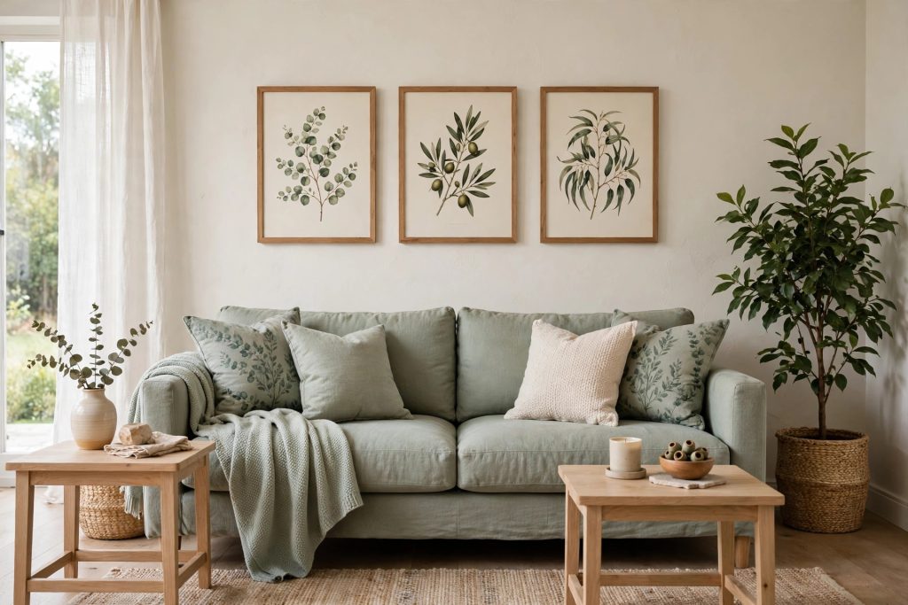
Choose a sage green sofa. Sage is soft enough to act like a neutral, but it still gives the room a clear point of view. It pairs beautifully with warm white walls, light wood and cream cushions. If you are nervous, look at the fabric in your own daylight before you commit, because sage can shift greener or grayer.
Paint walls a pale eucalyptus. Eucalyptus is a touch deeper and bluer than sage, and it looks lovely with white trim and pale floors. It tends to feel fresh in the morning and calm in the evening. Keep the ceiling warm white so the room still feels tall and airy.
Warm sage up with wood and brass. Sage can lean cool on its own, so balance it with warm wood tables, a brass lamp or tan leather accents. The mix of green and warm metal feels calm and a little bit grown up. This is usually the combination that makes sage look expensive rather than pastel.
Test sage in small doses first. Cushions, a throw, curtains or one piece of botanical art can bring sage in without any big spend. Living with the color for a few weeks tells you whether you want more of it. Renters especially love this route, because it all leaves with you.
Blush and clay
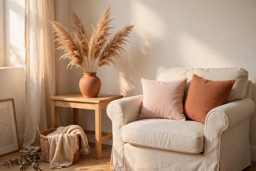
Scatter blush through your textiles. Blush pink cushions and a soft throw warm up a gray or beige sofa without turning the room sugary. Muted, dusty blush works best because it behaves almost like a neutral. Pair it with cream and light wood and it usually feels gentle rather than girly.
Use clay and terracotta as your earthy accent. Clay tones bring the warmth of baked earth into the room through vases, pots, cushions or a single chair. They sit naturally beside beige, cream and sage, so they rarely clash. A few terracotta pieces grouped together usually look more intentional than one lonely pot.
Pick one blush or clay hero piece. A dusty rose armchair, a clay toned rug or a large piece of art gives the soft palette a focal point. Keeping the rest of the room neutral lets that one piece sing. It is an easy way to try a romantic color story without repainting a thing.
Deeper Accents Without the Gloom
Deep colors have a reputation for making rooms feel small, but used in the right places they mostly make a room feel cozy and finished. The rules are simple, keep the ceiling and some textiles light, and let warm lighting do the rest.
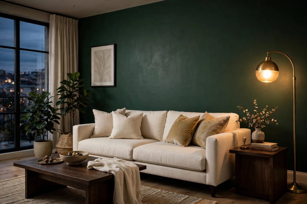
Paint one wall deep forest green. The wall behind your sofa is the classic spot for a deep accent, because the sofa breaks it up and softens the effect. Forest green feels rich without going as dark as black, and cream cushions glow against it. In evening light it usually looks cozy rather than heavy.
Bring navy in through cushions and throws. If a navy sofa feels like a leap, navy textiles give you the same depth in a smaller dose. Navy loves warm white, tan leather and natural wood, so it settles into a neutral room easily. Two or three navy pieces spread around the room look planned, while one alone can look lost.
Anchor the room with one deep furniture piece. A charcoal armchair, a deep brown leather seat or a dark wood cabinet gives a pale room some welcome weight. One strong piece is usually enough, because it grounds everything around it. Keep the pieces near it lighter so the contrast feels balanced.
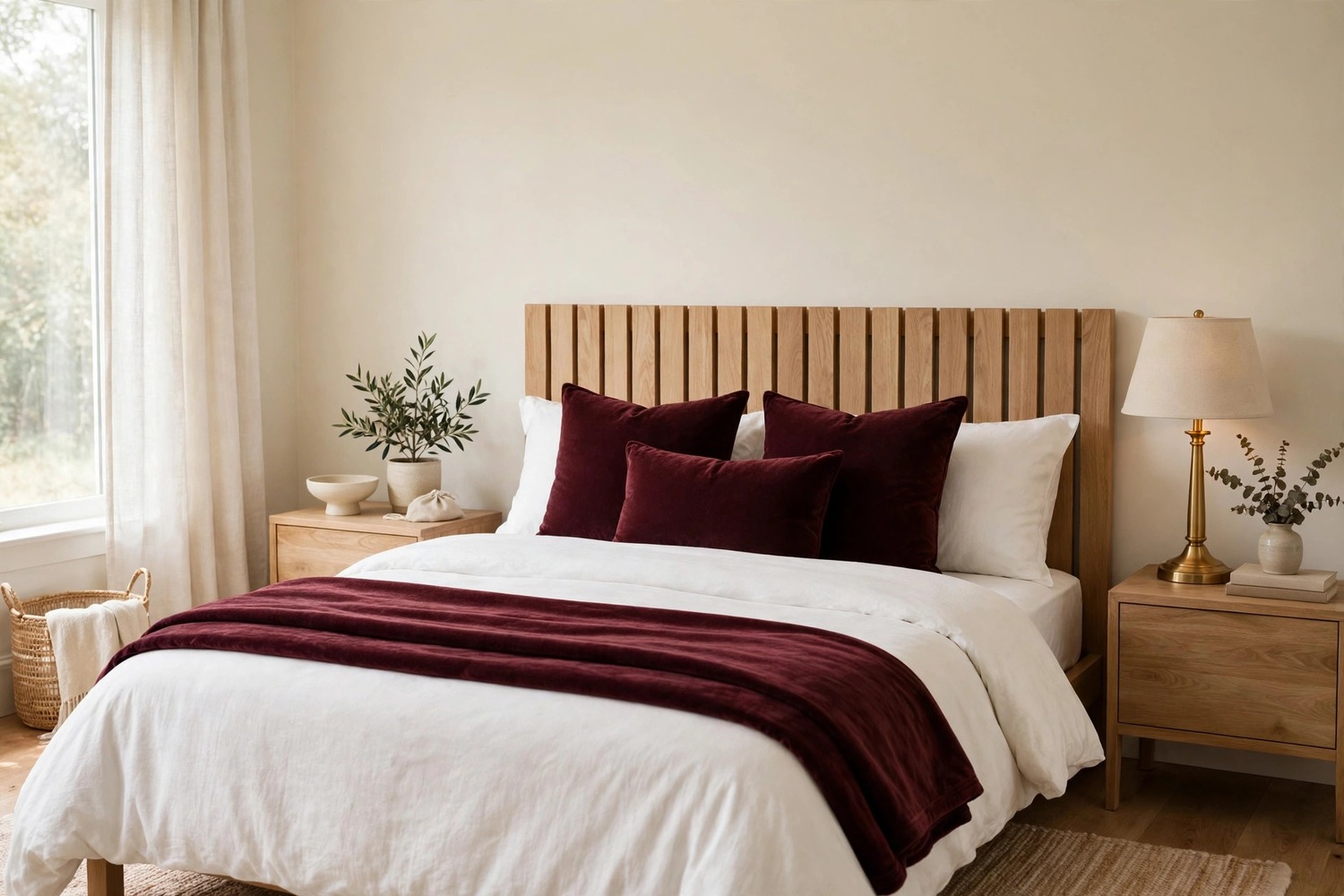
Warm things up with rust and burgundy textiles. Rust, brick and soft burgundy cushions add autumn warmth that suits neutral rooms beautifully. They pair well with clay and terracotta, so you can build on colors you already have. Swapping these in for a season is a low effort way to change the mood.
Try a deep teal statement chair. Teal sits between blue and green, so it flatters both sage walls and navy accents. A single teal chair in a calm room becomes the piece everyone wants to sit in. Add a cushion in cream or blush to tie it back to the rest of the palette.
Balance deep colors with light and warmth. Deep shades stay friendly when the ceiling, rug or sofa stay pale and the lighting stays warm. A brass or wood toned lamp beside a dark wall keeps the corner glowing instead of gloomy. This balance is typically what separates a moody room from a dark one.
Test the deep shade somewhere small first. Paint the back of a bookcase, the inside of an alcove or a single door in your deep color before you commit to a whole wall. Small areas show you how the color behaves in your light with almost no risk. If you love it there, you will probably love it bigger.
Color does not have to arrive all at once. Start with the calm neutrals you know you can live with, add a soft color or two, and save the deep accents for the spots that need a little drama. Your living room will usually tell you when the balance feels right. And if a color stops making you happy, paint and cushions are some of the easiest things in a home to change.

Leave a Reply